SUPERSTORE SALES DATA ANALYSIS PROJECT
Project Description:
This project demonstrates the approaches I followed to conduct descriptive and diagnostic analysis on a dataset obtained through Kaggle.com that contains sales data for a superstore in the United States from 2015 to 2018.
This project was intended to provide three levels of analysis and, as a result, answer three "Why" questions in each component of the final dashboard, as well as provide insights and highlight trends within the dataset.
Tools Used In This Project:
1. Microsoft Excel: used to explore and clean the data.
2. Microsoft Power BI: used to analyse, visualize and report the results to the client company.
Problem Statement:
This project was created on the assumption that the stakeholders (the management team) require a comprehensive report that answers the following questions:
1. How has our sales performance been since 2015?
2. How much revenue have we made since 2015?
3. How many units have we sold?
4. Where did the most sales occur?
5. What were our best-sellers during this time period?
6. What items and shipping methods do our customers prefer?
7. Where did we get most of our orders?
8. Who are our most important buyers?
9. What are the possible causes of our sales rise or decrease?
10. What patterns can we identify in the data that can help us enhance the business?
Dataset:
The dataset was a single csv file that contained the superstore's sales data from 2015 to 2018, and it consisted of the 17 columns listed below:
-
Row ID
-
Order ID
-
Order Date
-
Ship Date
-
Ship Mode
-
Customer ID
-
Customer Name
-
Segment
-
Country
-
City
-
State
-
Postal Code
-
Region
-
Product ID
-
Category
-
Sub-Category
-
Product Name
-
Sales


Phase 1: Strategy:
I used the following strategy to respond to the stakeholders' questions:
-
When it comes to analysing geographical data, make sales (revenue) the major KPI.
-
When it comes to product analysis, make quantity (Units Sold) the major KPI.
-
constructing a three-level analysis for geographical data by giving visualisations that show sales performance as follows:
-
Level-1: how much were sales by region?
-
Level-2: for every region, how much were sales by state?
-
Level-3: for every state, how much were sales by city?
-
-
constructing a three-level analysis for products data by giving visualisations that show quantity sales performance as follows:
-
Level-1: how much quantity sold by product category?
-
Level-2: for every product category, how much quantity sold by product sub-category?
-
Level-3: for every product sub-category, how much quantity sold by each product?
-
-
Analysing our clients by location and number of orders to see if there is a relationship between the number of customers in each state and the number of orders placed by those customers (determining whether customers are active or not).
-
Using revenue (sales) as the major determinant of customer profitability to the business.
-
Calculating the average amount spent by customers and the average number of products purchased by each order to help understand customers behaviour.
-
Analysing sales by year and category to determine the likely causes of a rise or drop in sales over the investigation period (2015-2018).
-
In an attempt to improve the business, I used the following methods:
-
Investigating which products saw an increase in sales and which saw a decline.
-
Highlighting the most popular products in each state.
-
Analysing sales and orders by year and overtime to look for periodic seasonal trends.
-
Phase 2: Data Exploring, Preparing & Cleaning:
I Followed the following steps to look for problems within the data:
-
Creating a copy of the original raw data and saving it as an excel file instead of a csv file.
-
Formatting the data as a table by highlighting all the data and pressing the shortcut CTRL+T.
-
Giving The Table a name. (Sales_Data)

-
Searching for duplicate values withing the key columns (Order ID and Customer ID in this case) by selecting each column separately and using conditional formatting to highlight duplicate values in red. And that produced the following result:

This result was questioned because a large number of duplicates were discovered, but when investigated, it was discovered that these duplicate values were caused by customers ordering several items in one order, and hence these results are not duplicates.
-
Extracting the year and month from the order date:
This was done using the YEAR and TEXT functions respectively:


-
Searching For Blanks within the data:
This was achieved by selecting all of the data and using the "Go To Special" feature of excel:

-
Null Values Within The Postal Code Column:
The previous step revealed that there were some blanks in the postal code column, but because the postal code data was unrelated to the analysis, the records weren't deleted in order to protect the analysis's accuracy:

Phase 3: Conducting The Analysis To Answer The Business Questions:
I Followed the following steps in this phase:
-
Loading data into MS Power BI and transforming the data:
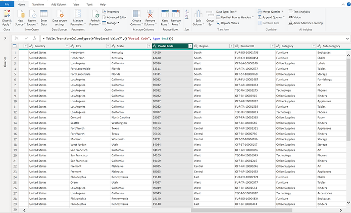
To avoid adding up the values when utilised in a table visual, the postal code data has been converted to text format:
-
Creating The Necessary Measures Using DAX:
The following measures were created to be used in the analysis:
-
Sales_mes = SUM(Sales_Data[Sales])
-
Quantity = COUNTA(Sales_Data[Product ID])
-
# of Orders = DISTINCTCOUNT(Sales_Data[Order ID])
-
# of Customers = DISTINCTCOUNT(Sales_Data[Customer ID])
-
All customers in states = CALCULATE([# Customers],ALL(Sales_Data[State]))
-
Customers % In States = DIVIDE([# Customers],[All customers in states])
-
Average Sales per Year = SUM(Sales_Data[Sales])/ DISTINCTCOUNT(Sales_Data[Year])
-
Avg Quantity Sold = COUNTA(Sales_Data[Product ID]) / DISTINCTCOUNT(Sales_Data[Year])
-
Preferabilty (Quntity/Customers) = DIVIDE([Quantity],[# Customers])
-
% Contribution to Total Revenue = DIVIDE(CALCULATE([Sales_mes],ALLEXCEPT(Sales_Data,Sales_Data[City])),CALCULATE([Sales_mes],ALLEXCEPT(Sales_Data,Sales_Data[Region],Sales_Data[State])))
-
Change In Sales % = (DIVIDE(CALCULATE(SUM(Sales_Data[Sales]),FILTER(Sales_Data,Sales_Data[Order Date].[Year] = MAX(Sales_Data[Order Date].[Year]))),CALCULATE(SUM(Sales_Data[Sales]),FILTER(Sales_Data,Sales_Data[Order Date].[Year] = MIN(Sales_Data[Order Date].[Year]))),0) - 1)
-
Sales Change Icon =
VAR IconPositive = UNICHAR(9650)
VAR IconNegative = UNICHAR(9660)
Var Result =
IF([Change In Sales %]>0,IconPositive,IconNegative)
Return
Result
Phase 3: Constructing The Final Report:
The final dashboard was designed using a simple, user-friendly layout that helps in data storytelling. It was primarily made to cover the following aspects:
-
KPIs:
-
Total revenue (Sales)
-
Total quantity (Units Sold)
-
Total orders.
-
# of customers who ordered
-
Sales % (2015-2018)
-
Average amount spent by customers.
-
Average quantity per order.
-
-
Sales By Location:
-
Sales by region (level-1 of the analysis).
-
Sales by state (Level-2 of the analysis).
-
Sales by city (Leve-3 of the analysis).
-
Sales trend for locations for the period between 2015 & 2018.
-
-
Sales By Product:
-
Sales by category.
-
Sales by segment.
-
Sales by sub-category.
-
Quantity by sub-category.
-
Sales by product.
-
Sales by year.
-
-
Orders By Customer:
-
Orders trend over time.
-
orders by shipping method.
-
Distributions of customers orders.
-
Orders made by customers.
-
Quantity purchased by customers.
-
Amount spent by customers.
-
Most purchased product by customers.
-
-
Slicers and customized tooltips have been added to the dashboard to allow the user to explore additional insights as desired, and the images below are from the final dashboard:


Phase 4: Insights & Recommendations :
-
The analysis revealed the following findings and insights:
-
The year 2018 saw the highest sales, with a 50.47% increase over 2015.
-
The western and eastern regions had the highest sales (60% of total revenue), with California and New York states contributing the most and New York and Los Angeles cities being the top two buying cities.
-
The most sold product categories were technology and furniture, with phones and chairs sub-categories contributing the most to sales and "Stable Envelope" being the most purchased product with 47 purchases and "Canon image-Class 2200 advanced copier" being the top seller with sales worth nearly 61,600$ .
-
The majority of customer orders came from California and New York, with California hosting more than 20% of the orders and New York hosting 11%.
-
Customers seems to prefer standard class shipping over other shipping modes, as evidenced by the fact that it accounted for more than 59% of all orders made by customers.
-
The total revenue earned between 2015 and 2018 is $2,261,536.78 dollars.
-
The total number of units sold was 9,800.
-
There were 4,922 distinct orders in total.
-
The average annual revenue is 565,384.2$.
-
The average number of units sold per year is 2,450.
-
Each year, an average of 1,231 unique orders are placed.
-
A typical customer spends $459 dollars per order.
-
Periodic patterns which have occurred in a consistent manner over the years 2015 to 2018 have been noticed. Sales typically tend to increase in early February and then decline after March. Also, sales tend to rise through early August, fall in September, rise again in early October, and fall all the way through November and December.
-
The Waterfall chart on the report shows clearly that reason behind the decrease in sales of the year 2016 came as a result of drop in sales of the technology and office supplies products.
-
Products experienced rise is sales between 2015 and 2018 as demonstrated by the table on the left except for the "Machines" and "Envelopes" sub-categories.
-
-
The report also included the breakdown the followings:
-
States with increase in sales.
-
States with decrease in sales.
-
Products with increase is sales.
-
Products with decrease in sales.
-
#1 sold in every state.
-
Sales % of every product category for each geographical region.
-
Phase 5: Sharing The Results:
Explore the interactive dashboard on this page:
Or View the report in Microsoft Power BI platform :
References:
Dataset: Superstore Sales Dataset. (n.d.). Superstore Sales Dataset | Kaggle. https:///datasets/rohitsahoo/sales-forecasting
Superstore Image: Limited, A. (n.d.). The logo on the front of a Real Canadian Superstore a supermarket chain in Canada Stock Photo - Alamy. The Logo on the Front of a Real Canadian Superstore a Supermarket Chain in Canada Stock Photo - Alamy. https://www.alamy.com/stock-image-the-logo-on-the-front-of-a-real-canadian-superstore-a-supermarket-169797595.html